Next up, filling the void of hobby on my hobby blog, is my friend Damon Drescher.
Damon lives on the other side of the country, in the fabled sunny and warm land of
southern California. An artistic director and designer by trade, Damon paints spectacular
models and absolutely killer freehand work as you can see on the Freeblade Knight
he has painted up for this year's Crystal Brush awards. Take It away Damon!
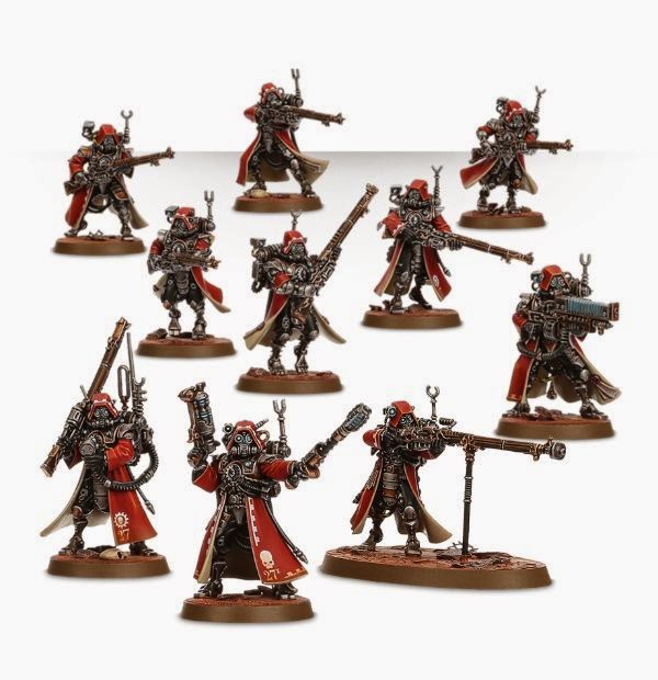
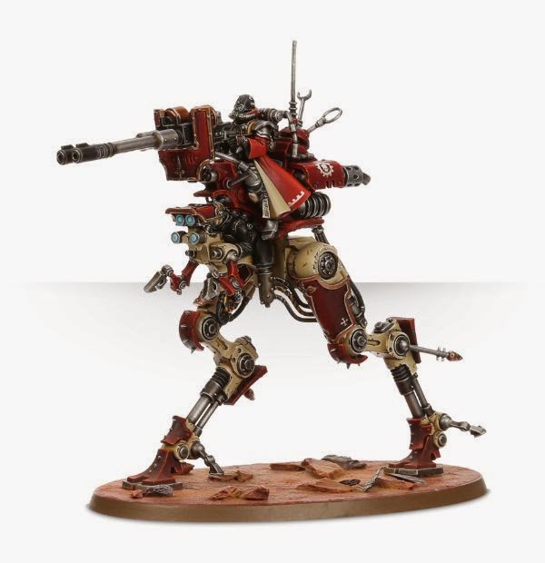
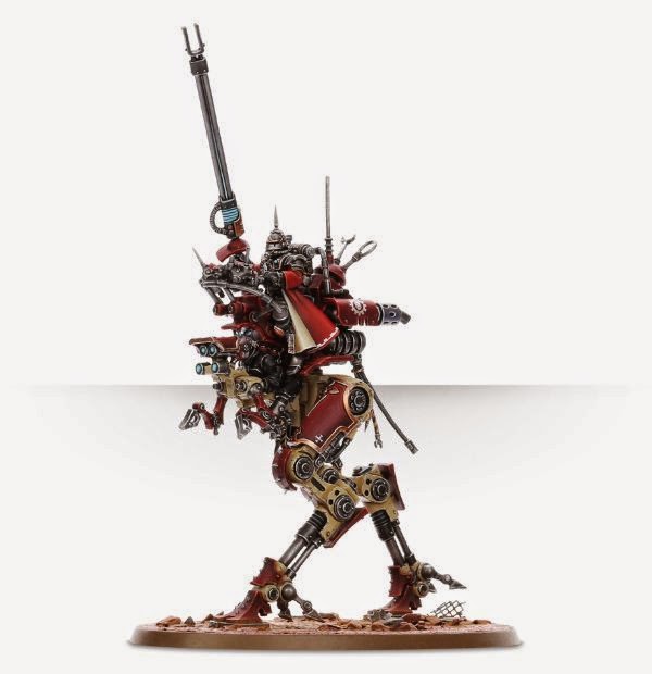
Every October or early November for the last few years, I've start working on my Crystal Brush entry for the coming year. I find I have free time over the holidays that lets me really dedicate time to a project. I had good success with a Contemptor Dreadnought last year in the Sci-fi/Monstrous Creature category. This year I decided to stay in that category with an Imperial Knight as my entry. The Knight project came out of a new event planned for this year's AdeptiCon – Knightfall: The Grand Tournament of Draconis III The event is being developed and hosted by AdeptiCon perennial David Pauwels (who authored the article just before mine). I met David at my first AdeptiCon 5 years ago and I've been lucky to be associated with him and some of the finest guys and gals in the hobby ever since. David brought up the idea of a Knights duel at AdeptiCon where we paint up Knights both loyalist and heretic and have them battle it out mano-y-mano just like knights of old. I thought this would be a great project and something I could really get into. Initially I planned it just as a gaming piece, but then as the project progressed it became clear this would be my entry for the Crystal Brush. My hope is they'll let me check it out of the Crystal Brush display case early on Sunday morning on the last day of the competition so I can put it on the table to play in the duel tournament. If not, I'll bring it next year.
![]()
![]()
Background Idea
My Knight would need a backstory and something to make him different from all the other duelists. I always come up with a background for my models as I work on them. I started out looking for inspiration through all the GW Knight artwork and just thought the European knightly style wasn’t for me. I looked into the Freeblades for inspiration, but none of them was quite right so I pushed on for a different concept. I recently went on a business trip to Japan and found my inspiration there. I would give my Knight a Japanese feel and background. A Samurai Knight could be fun, but wasn't right either. A Yakuza Knight Freeblade - now that was something I didn't think had been done before. So the idea started to form and solidify. The Knight would be a Freeblade from a planet lost to "Old Night" that had fallen back on the model of the feudal Japanese society. A clan of mercenaries and thieves had been placed in charge of Knights on this world to protect it from all threats.
![]()
![]()
Developing the Imagery
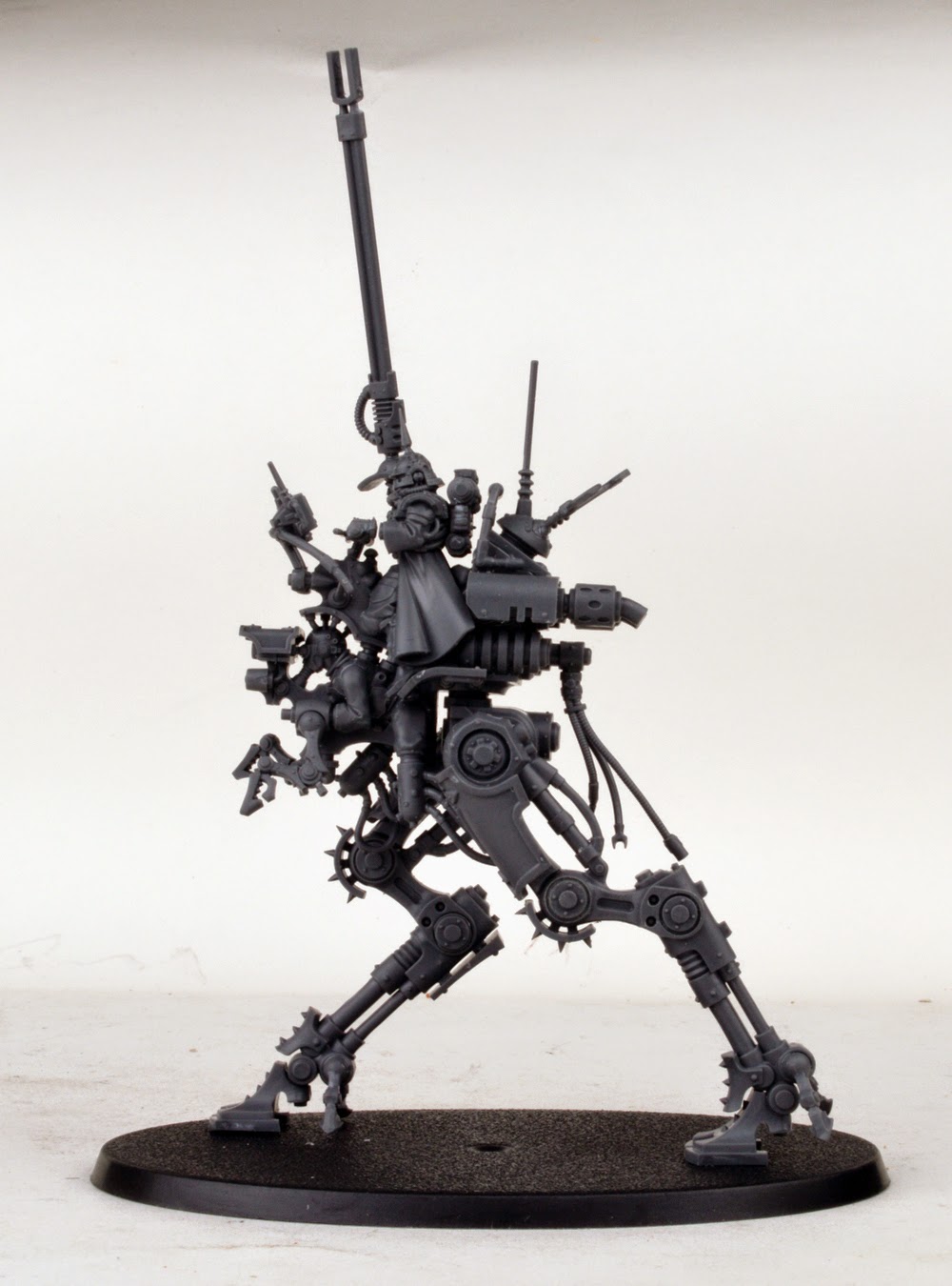
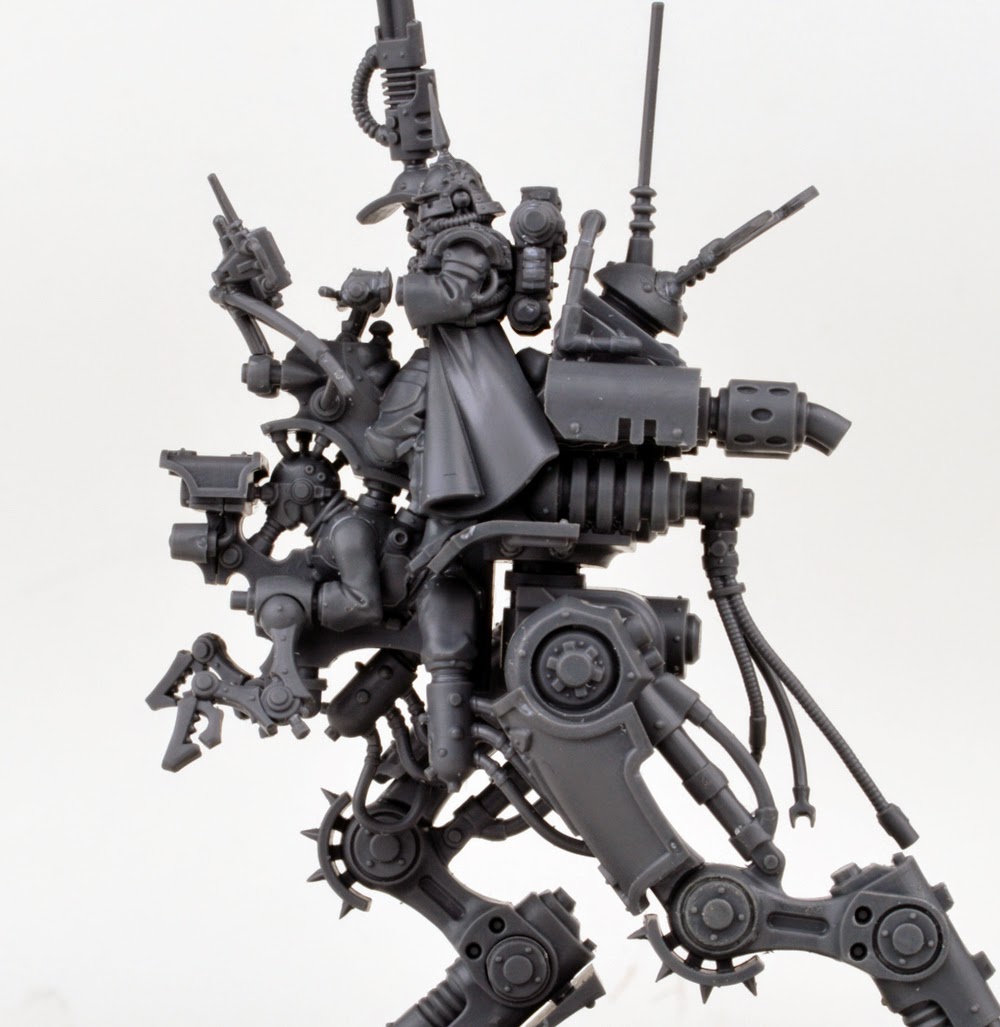
I imagined that many of the planet’s gang members decorated themselves with irezumi (traditional Japanese tattoos). I decided that after taking over the planet’s noble houses, the mercenaries took to covering their Knights with artwork inspired by these. Next I decided the Knight's mask needed to be different as well. I contacted Chris Borer (multiple Golden Demon and Crystal Brush winner. Sorry I name drop a lot in this article) to discuss ideas. I even initially approached him to sculpt the mask for me. I sketched up several ideas and shared them with him, but before he could get started on it I chose to give the sculpt a try on my own. I applied grey stuff to the existing Knight mask, using it to give me the basic form. Soon I had something I thought could be workable. After many chats and discussions with Chris and other sculptors, I found a way to smooth out and finish the mask to my satisfaction. The trick was 600 grit sandpaper super glued to the end of a tooth pick. It allowed me to get into all the tight spots on the mask and smooth out the rough edges. The mask was also based on a traditional Japanese element: the mempo mask. A sashimono (samurai back banner) would add a striking vertical element to it and a place to add a bit more freehand. Everyone made fun of me for adding a banner, as its one of those things that I often like to do on a model to add interest.
Next the Knight needed a color palette. Wanting a red mempo mask meant that it needed to have a strong contrast to make the mask pop. Green is the strongest contrast to red, but this raised a real concern because red and green are so associated with Christmas (a Knight-Santa wasn’t exactly the look I was going for). After searching the internet for images, I found a green samurai with a red mask. The greens were all accented with bluish shades - this seemed perfect. So the project began to take shape and depth in my head and on the work table.
Realizing the Concept
Assembly of the Knight kit was easy enough, lots of cleaning and scraping required as always. The scale of it at first intimidating, but was something I found I really liked after a while. I could get into all the areas of it easily enough. I assembled it without the armor plating and airbrushed a base of metallics on it. I then shaded and toned each separate assembly, paying close attention to each part. I even gave some Mig washes a try and was very happy with the results.
Armor plating was next. Working with Minitaire paints from Badger, I got a green that I immediately really liked. I posed the model over and over till I got an interesting pose figured out. I used Blu-tack to get it just how I wanted, and then glued the joints to fix the positions. The project was making itself easy; it was one of those that just flowed. To make the paint job seem a bit more realistic I used a technique I learned at AdeptiCon a few years ago from Sebastian Archer: staining the model with another color to help blends. In areas where the greens got darker I tinted the area between transitions with a dark brown. The gold metallic trim was done with an airbrush after masking out all the armor plates with liquid mask. I used Vallejo metallics for the most part and really liked the quality of them. I tinted the golds with greens and purples. I'd not tried that before, but found it to be a huge time saver. I researched a lot of irezumi to find the right inspiration for the armor panels. Funny enough, I didn't really draw out the tattoos. I just made a rough sketch of them on the armor with a pencil and then started painting them. I looked back to reference pics for the right finishes. With the curved plates I sort of had to make changes on the fly to get the panels filled and looking right. Finally, I added lots of nicks and scratches to the armor to add interest.
After all this I needed a base to put the model on. I settled on keeping with the Japanese flavor and tried to replicate a Shinto grave yard. Wanting to keep it in the 40k universe I added Mechanicum details, such as mechadindrites and hoses of brass and copper acting like roots coming from a grave marker underneath the Knight. This gives the impression he's protecting this place even as he knocks over one of the stones. I added some red earth pigments to tie in the red of the mask and plenty of greens to unify the overall theme. The model was finished early January. Well, I have a few minor touches I still want to do, but other projects need my attention as well.
Conclusion
All in, the project was about three solid months of work. I really enjoyed it and I recommend the Imperial Knight kit from GW. I'm planning to get a FW Knight next to add to my collection. I hope you like the results, and see you at AdeptiCon!